Pantone
Color of the Year 2026

Product & Lifestyle Section Campaign Imagery

Photography · Production · Post-production

Photographing Cloud Dancer

Client

Pantone

Role

Lead Photographer

Scope

Photography, Production Support, Post-production

Deliverables

Product Photography, Lifestyle Photography, E-commerce Assets

屏幕截图 2026 06 21 221355
屏幕截图 2026 06 19 204346

Overview

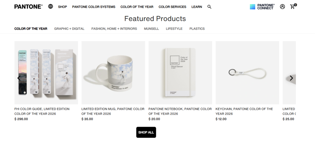
For the PANTONE® Color of the Year 2026 campaign, I photographed a product and lifestyle image library for PANTONE 11-4201 Cloud Dancer.

The collection ranged from clean, e-commerce-ready product imagery to lifestyle scenes built around moments of calm, focus, and everyday ritual. Together, the images needed to work both as individual retail assets and as a cohesive visual system across Pantone’s Color of the Year experience.

The Brief

The goal was to create a consistent set of images for the Cloud Dancer collection that could work across multiple online contexts:

  • Product listing pages
  • E-commerce thumbnails and detail views
  • Color of the Year lifestyle content
  • Editorial and promotional placements

Each product needed to remain clear and recognizable at a glance, while the larger image system needed to communicate the quiet, tactile atmosphere behind Cloud Dancer.

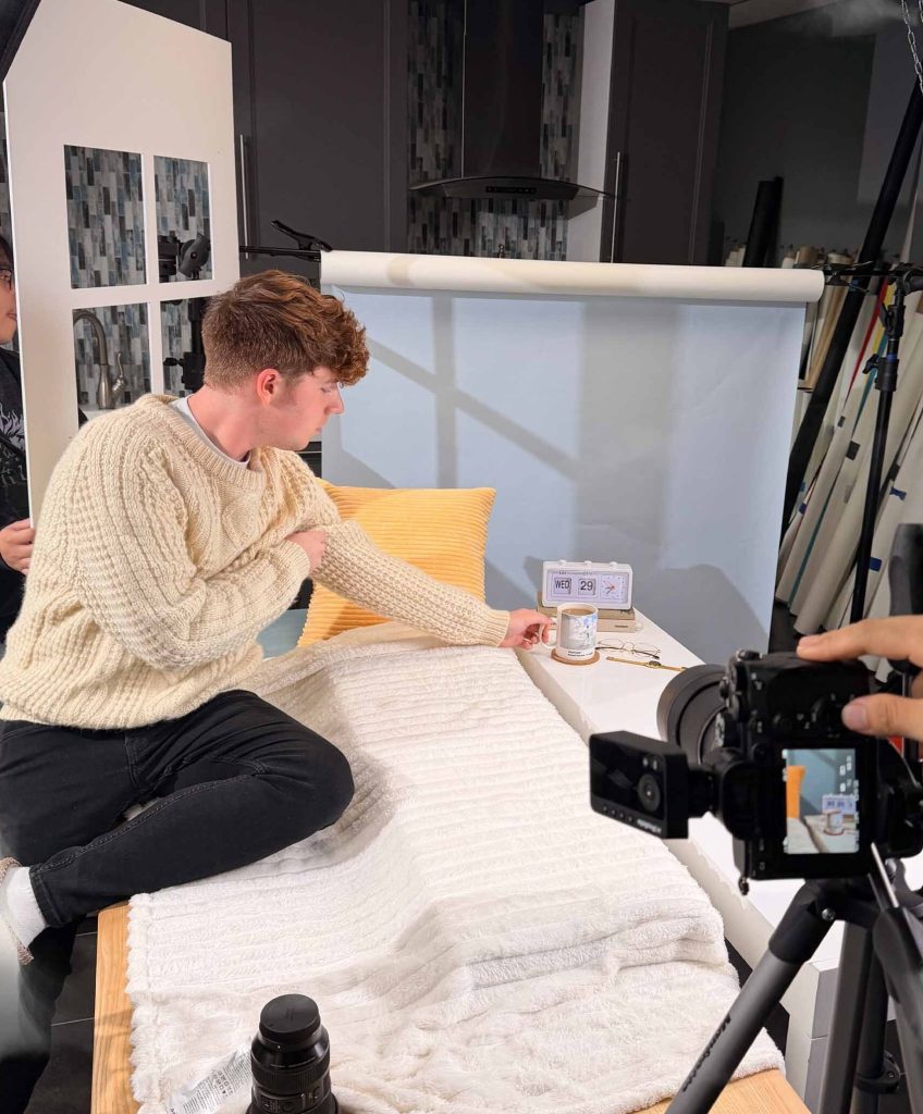
pantone bts 1
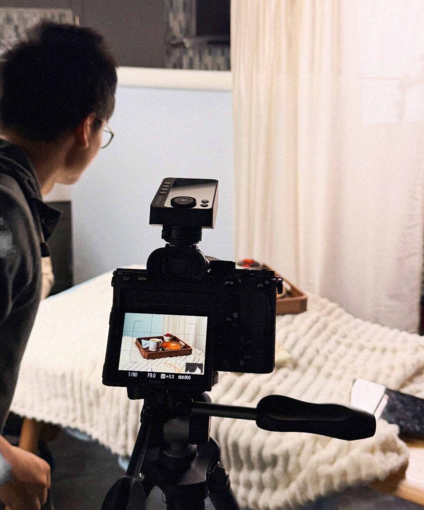
pantone bts 2
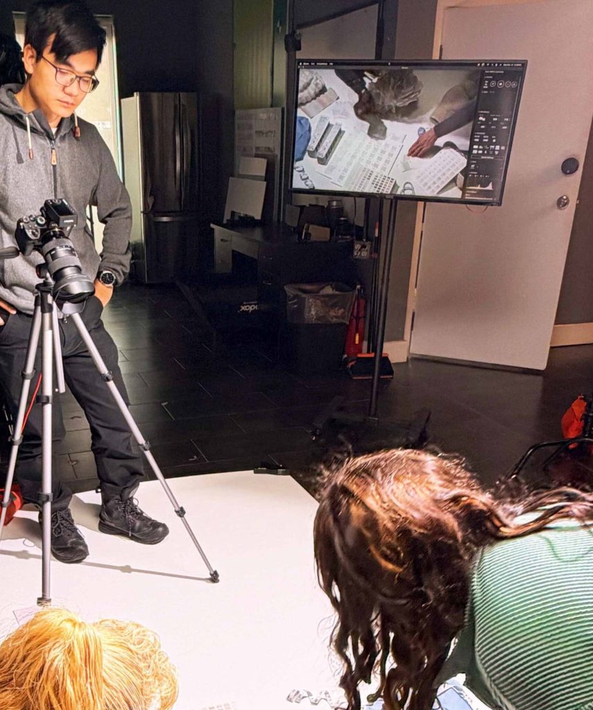
pantone bts 3

The Approach

Product Photography

With a near-white palette, the product photography depended on subtle tonal separation rather than strong contrast. Soft directional light and restrained shadows were used to define edges, surfaces, and material differences without making the images feel heavy.

Particular attention went to preserving texture across ceramic, paper, textile, metal, and packaging while keeping the collection visually consistent.

Lifestyle Photography

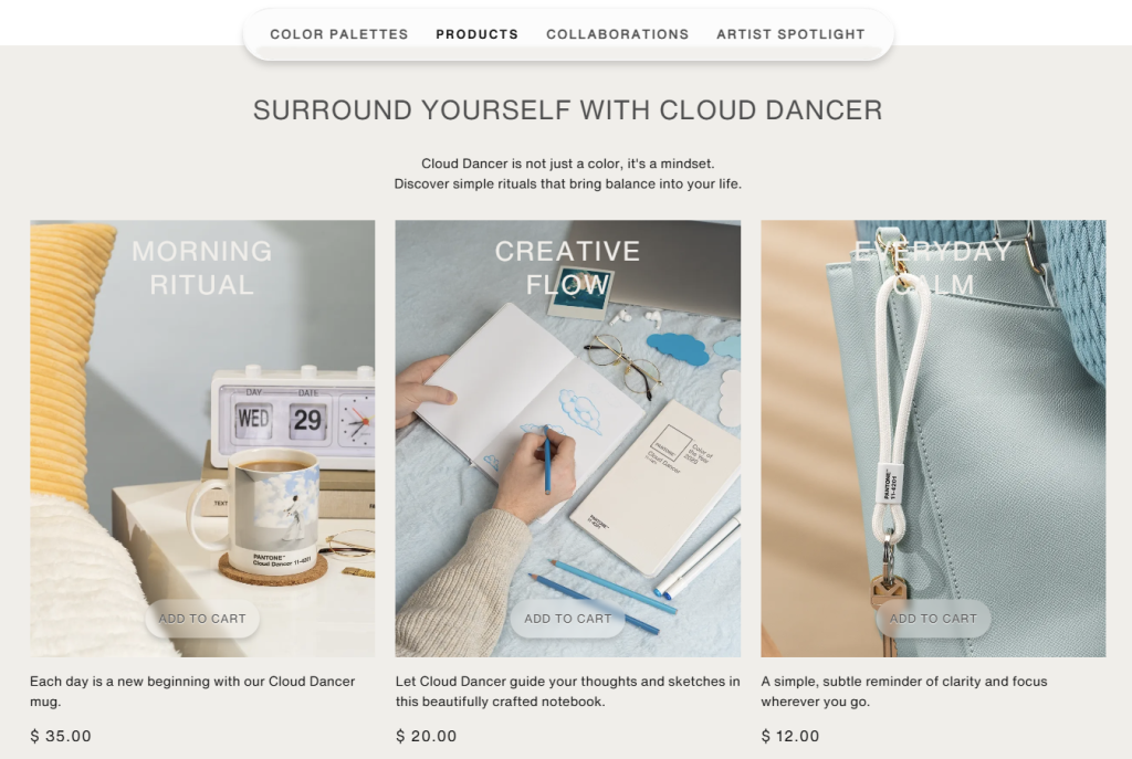
For the lifestyle imagery, the products were placed within three everyday narratives:

  • Morning Ritual
  • Creative Flow
  • Everyday Calm

Rather than styling the products as isolated objects, each setup placed them within a recognizable routine – making coffee, working, writing, or pausing at home.

Soft blues, warm neutrals, textured surfaces, and natural materials introduced enough contrast and warmth to define the scenes without competing with Cloud Dancer itself.

The Result

The final image library gave Pantone a consistent set of product and lifestyle assets for the Color of the Year 2026 launch, spanning e-commerce, editorial, and promotional use.

Across both the controlled product images and the more contextual lifestyle scenes, the photography maintained a shared visual language built around subtle contrast, material detail, and tonal consistency.